Best HUD Settings, Presets and Colors in Black Ops 6 Beta

Call of Duty games have many configuration options that you can adjust to customize the game’s graphics, sounds, controls, and interface to suit your needs. With Black Ops 6 Beta, the developers have added even more HUD settings that you can change to customize the gameplay experience.
Best Gameplay HUD Layout/Preset in Black Ops 6 Beta
You will see the Gameplay HUD tab on the top of the game Interface settings menu. The first option, HUD Presetsallows players to choose from several different layouts available. You can choose from any HUD style you like, that said, here are my picks for some of the best HUD layouts to use in Black Ops 6:
- Classic: Of all the available options, I prefer to use the Classic layout because it seems the cleanest to my eyes. You’ll get the minimap and objective counter at the top left; the HP bar on the bottom left; Field Upgrade and Equipment in the lower center; and Scorestreaks and ammo count at the bottom right of your screen.
- Norm: The Standard layout is almost identical to the Classic but with one difference: the Field Upgrade and Equipment indicator is moved from the center to the lower right, next to the ammo count.
- Enlarged: As the name suggests, all HUD icons are magnified when you equip the Magnified layout. It follows the Standard layout theme and I recommend it to players who have difficulty seeing the information, have a large screen or sit far from the screen.
Best HUD Color Settings in Black Ops 6 Beta
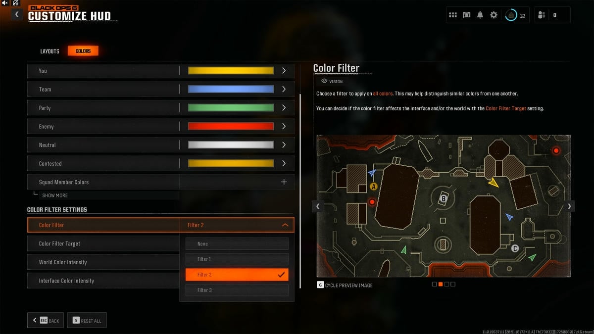
Click on the Colors tab next to Settings and here you can further customize how your HUD appears in Black Ops 6 Multiplayer. In the Interface Element Colors section, you can individually set the color of your character, teammates, party members and enemies. The default color scheme is great, but feel free to adjust it to your liking. In addition, you can change the HUD Color Palette setting so that the indicators are more suitable for your color blindness (Protanopia, Deuteranopia, Tritanopia).

The most important setting in this section for is Color Filter (see image above). By default, it will be set to none, but I want you to change this to Filter 2 because it increases the vibrancy and expands the HUD colors, thus improving your visibility. Make sure to change the Color Filter Target to Both of them and the World Color Intensity to 100 for best results.
Best Game HUD Settings in Black Ops 6 Beta

Now, go back to the Gameplay HUD settings and adjust the options as follows, if you haven’t already.
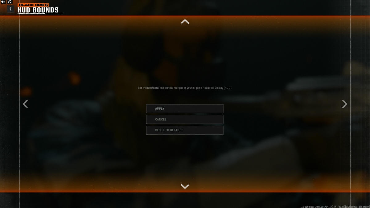
- HUD Limits: A configuration that most benefits players who sit close to a large screen. If you are this person and have trouble reading the HUD (minimap, equipment), adjust the borders using this setting and make them a little closer to the center of the screen as shown in the image above.
- Minimap Form: Square (for more range)
- Minimap Rotation: On
- Radar: Disabled
- Compass Type: Minimap or Off (irrelevant due to no compass enemy pins in Black Ops games)
- Vehicle HUD Prompts: Fade after 10 seconds
- In-game Text Chat: On
- Player Names: Full Name
- Hit Marker Visuals: On (so you know when a target is hit)
- Damage-based Hit Tokens: On (so you know the difference between head shots and body shots)
For more on Call of Duty, check out Best Pros in Black Ops 6 Beta in Pro Game Guides.


