
Like all other popular gacha games, Wuthering Waves uses a lot of color coding to represent various items, divide characters/weapons into their star ratings, and display attack attributes, among other things. For gamers who struggle to differentiate color, or those who are color blind, it looks like the devs at KURO GAMES made some glaring accessibility mistakes.
This Reddit post highlighted several examples of inaccessibility in Wuthering Waves. I’m not colorblind, but I have other vision problems and I agree that there are many small changes needed to make Wuthering Waves a better game for everyone. It’s hard enough to learn all the terms and item names from Wuthering Waves without adding these things.
Many players in the post offered their own thoughts, with quite a few comments from players who are not colorblind, as well as those who are.
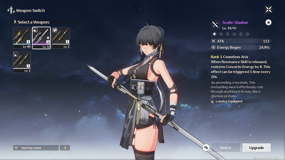
The main thing seems to be that Wuthering Waves uses a certain shade of blue and purple differentiate between four-star and five-star items.
The shades are so similar that players find themselves mixing the items up, with some commentators saying they wasted Ascension materials because the colors and designs are too similar to tell them apart.
As well as the color issue, some of the symbols in the game are simply too small. When you equip an Echo or a weapon to a Resonator, you can see a small portrait of the Resonator in the corner of the Echo/weapon image.
I struggle with this a lot, and other reddit commenters have the same problem throughout the game. The portrait symbol is so small it’s almost pointless – especially when characters have the same hair color.
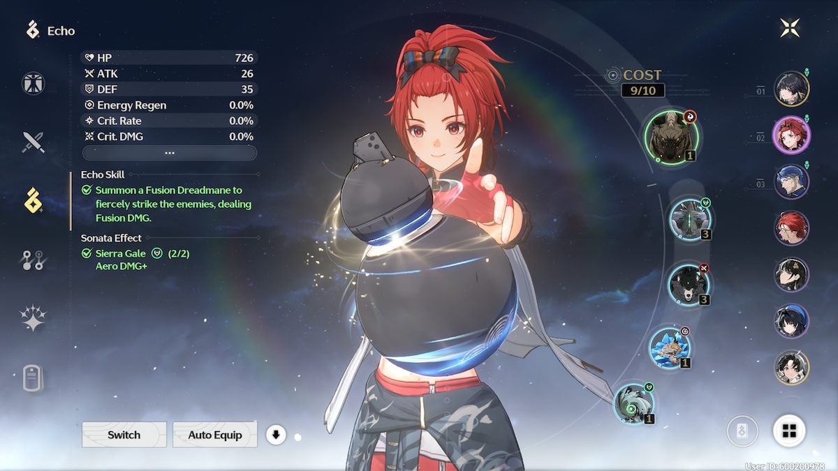
Similarly, the Echoes have small Attribute symbols and I honestly can’t make out most of them. I just use the automatic equipment and hope for the best.
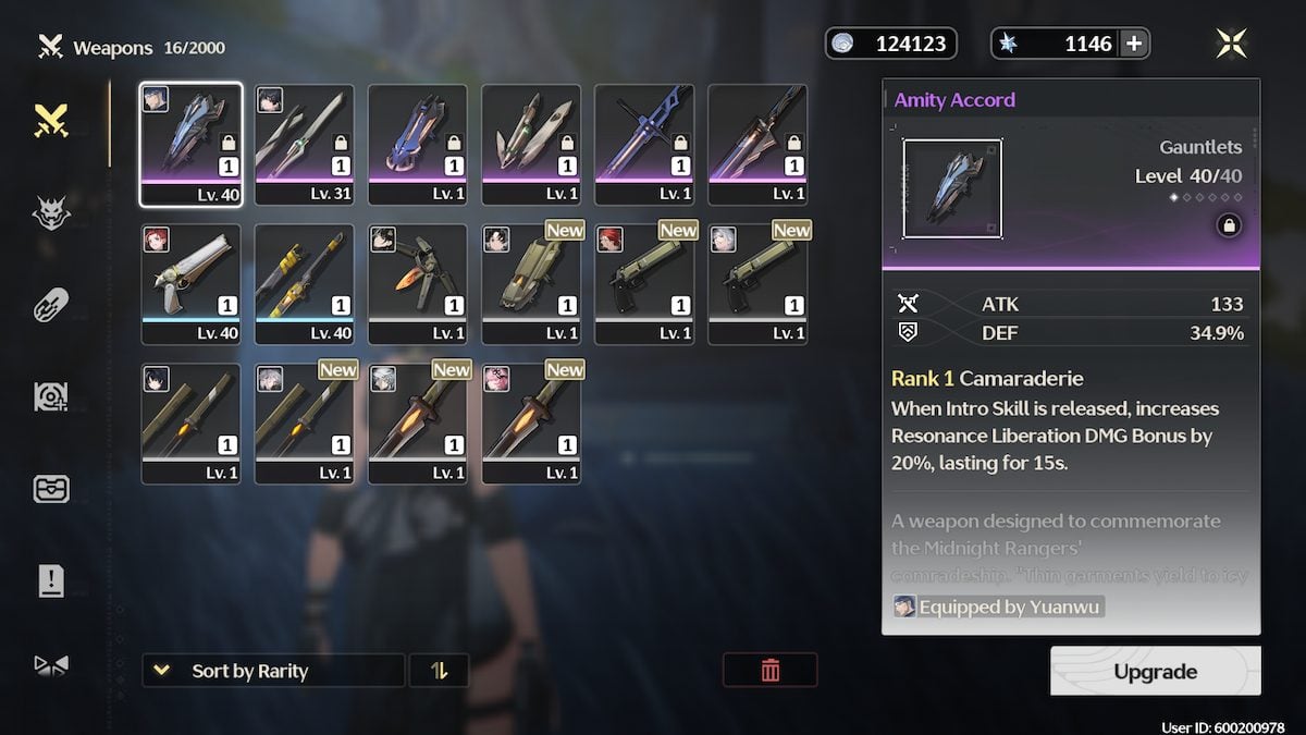
The third important thing is the lack of stars. Everything is color coded, rather than directly saying that an item or character is four or five stars, etc. Having some star symbols would mean that players who struggle to see shades of blue and purple wouldn’t make as many mistakes. when upgrading characters/weapons or using materials. At least in HoYo games like Honkai Star Rail all five stars and four stars have a rarity indicator.
The hacking element of Wuthering Waves could also be a problem. The mini-game uses traffic light colors – red, yellow, green – but there’s no other way to know they’re different. Adding a small feature to each different color would enhance the accessibility of the game.
Wuthering Waves has so much potential. If you’re someone who struggles with the accessibility of the game, be sure to submit feedback via the Game Feedback button on the second page of your main menu.
Want to read more Wuthering Waves news at Pro Game Guides? Try The banner system in Wuthering Waves is better than any HoYo game and this is why either Wuthering Waves will succeed despite Genshin similarities, and it’s because of combat.


